I needed a dashboard for something sort of trivial, so I decided it would be a good time to use the Bits AI for it. It built the whole thing before I finished my coffee.
What I was tracking
PyPI replicates package files from an S3 bucket to a Backblaze B2 cache. New uploads get copied across by a warehouse Celery task, warehouse.packaging.tasks.sync_file_to_cache, while a separate reconcile job works through the files that predate the cache. There's a big backlog there (~8M files), so it runs continuously in the background, and I wanted one page that told me whether it was healthy, how fast it was going, and how much was left. (Spoiler: there's a lot left 😅)
Building that by hand is the usual chore. Pick the widgets, remember the exact metric names, write each query, set the time aggregation, drag everything into place. Call it twenty minutes (for me, probably forty since ADHD is a thing and I'm guaranteed to get distracted) if I'm not interrupted.
The prompt
So I opened Bits AI, the chat panel Datadog wedges into the right side of the screen, and described the dashboard in a sentence or two. It searched my telemetry, confirmed the task name on its own, and built the thing.
The prompt:
"Check status of s3 -> b2 sync- showing me tasks completed, errors, worker memory stats, task throughput
and durations (like p95 or something, whatever is best), and a little section for backlog and
trends over time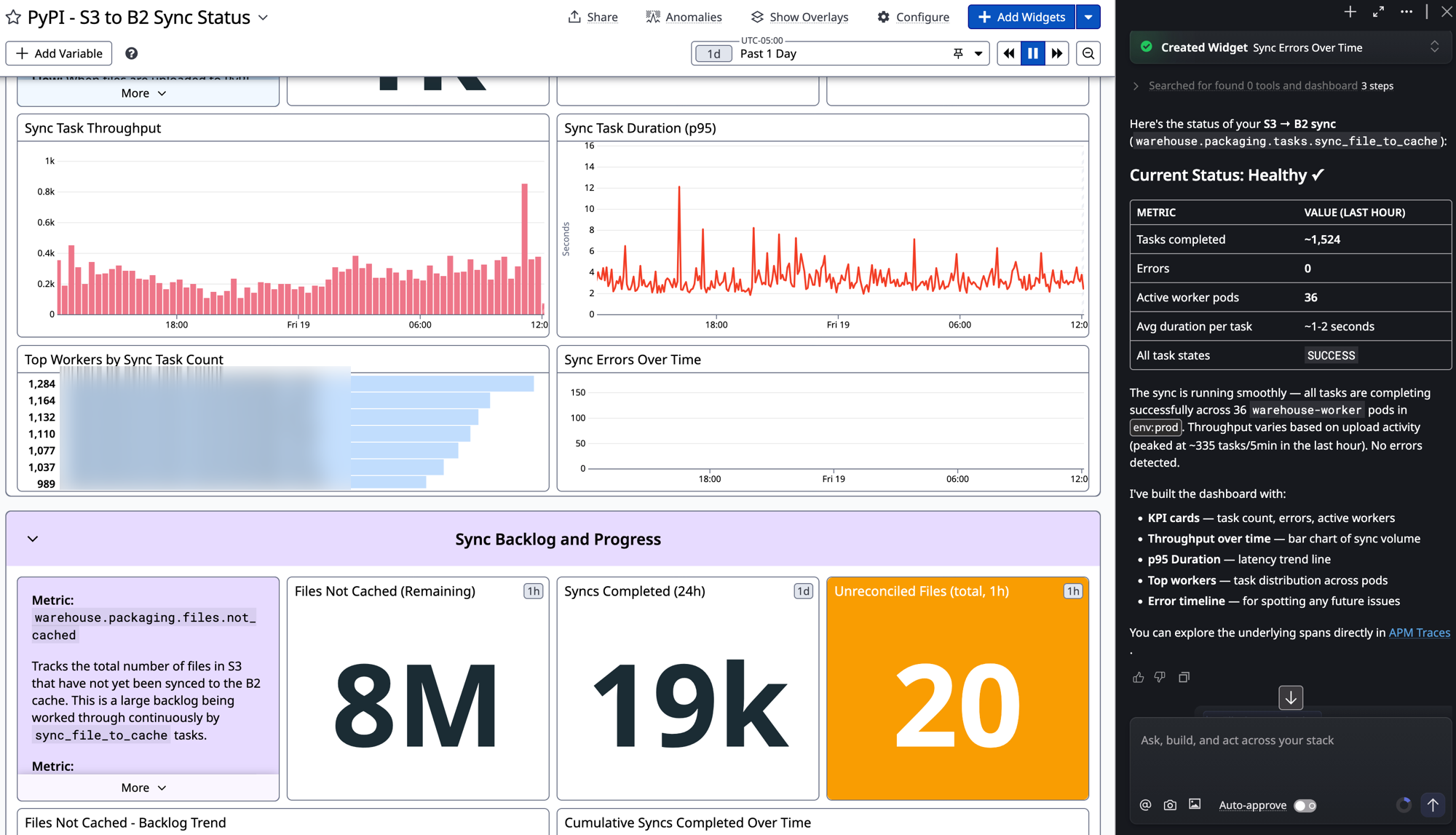
Here's what came back in one pass:
- KPI cards for tasks completed, errors, and active worker pods
- A bar chart of sync throughput over time
- A p95 duration trend line
- Top workers, ranked by task count across the
warehouse-workerpods - An error timeline, empty for now, which is the point
- A backlog group: roughly 8M files not yet cached, ~19k syncs completed in the last 24h, and 20 unreconciled files
It also wrote a status summary next to the chat. Healthy. ~1,524 tasks in the last hour, zero errors, 36 worker pods in env:prod, one to two seconds per task. Then it dropped a link into the APM traces so I could go read the spans directly.
The part I actually cared about
It didn't make up a metric. I've seen so many tools cheerfully generate a query against service.thing.count that has never existed. Bits went and found warehouse.packaging.files.not_cached and the real sync_file_to_cache spans, then built widgets against data that's actually flowing. It even annotated a couple of the widgets with what the metric means, which is the note the next person on call would otherwise have to dig for.
For infra dashboards that matters more than the visuals. A wrong query doesn't error, it just quietly lies to you during an incident.
Where I still did the work
The generated dashboard is a starting point, not the finished thing. I'm keeping a few decisions for myself:
- Tweaking thresholds and monitors.
- SLOs. What "healthy" means over the life of the backfill, etc.
- Layout. Bits got the widgets roughly 90% of the way there but I have opinions :)
- The throughput chart.
That's still a good trade. It turned twenty minutes of plumbing into one sentence and pulled the right metric names out of my own telemetry, which is the part I'd have spent the most time double-checking anyway. I could do other things and check back in until it was satisfactory.
If you want to try it
The bar is low! You need telemetry already in Datadog obviously, but once that's true, the most useful thing Bits does today is turn "I wish I had a dashboard for this" into a real one, built against your own metrics and spans, in about the time it takes to describe it.
I'll write more of these as I hit the rough edges. If you're doing something clever with Bits, tell me on @scriptr.dev!